


DTC 336 PORTFILLO
A Text Based Photo
A collection of two photos that were recreated using different text shapes with a variation of different colors and opacity.
Text based photo created on Illustrator

Real image of backpack
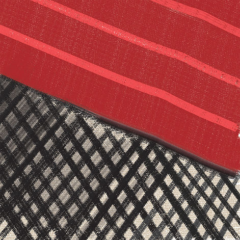
Texture Essay #1
This image is a close up of a bag. There are multiple points in this image both large and small. The first points that are noticed by me aren’t in the shape of circles but in the shape of diamonds. The book gives a good description, it says, “a point can express its own identify”(p.14). This point has its own identity because its an implied point it is in the space between the black netting. There are also points in all the intersecting spots of the netting as well. “Crossing of an X marks the spot”(p.14), this statement from the book works with the image of the bag and its netting. Above the netting on the red texture is a mass of points that make the bag look and have texture. There are lines in the red area that are created with a series of infinite points and they are on a different plane which allows this area to have depth. It’s a slight texture you can feel but if you look close you can see that texture change. The lines that are lighter red have a shine to them, this implies to us it has a smoother texture.
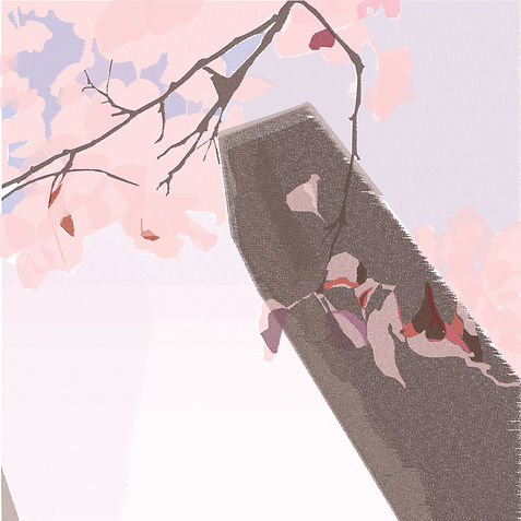

Texture Essay #2
This image is a picture of a hanging tree branch. It was taken in Chicago during the summer. The image has multiple areas of design we have talked about. It has points, lines, planes, scale, framing, texture and transparency. To start there are points throughout the image in a couple of ways. Points create a line, so if you follow the branches there is a makeup of physical points extending the length of the branches. As well the flower buds resemble points in the image, they are rounded and are the end of the branches. As I said earlier there are lines created by the path of the branches and also for the steams of the leaves. In the distance is a building and you can see the lines that create its shape. The scale is being shown with its context, we see the tree branch is the same “size” as the building but its scale is bigger because we are closer. The framing of this image also affects the scale because if I were to adjust it and focus on the building the branches wouldn’t look as big. The texture is hard to see in this digital rendering of the photo. You can see in some spots the depth changes for the leaves and branches. This texture has to be created from memory, you know its there and you have felt branches/leaves before. Lastly, we have a plane and transparency that work together. We see transparency in the leaves due to sunlight shining on them. They are then on different planes so that makes them layered on top of one another and we see a change in the opacity of the leaves.
Patterns of a Key
A variety of patterns created through the shape of a computer key.


The keyboard shape that was used to create the shapes and designs for each pattern made.
Patterns of a Key
The goal of this project was to create a pattern from a shape that meant something to your everyday life. I decide to choose my laptop keyboard keys as my shape. This is a shape I use every day and it means a lot to me. I am always on my computer and it consists of me using my keys for hours. Since it’s a major daily use to me I figured it would be the best idea for a pattern shape. This key shape is a square with slightly rounded corners. This shape is something I will use for the rest of my life as I am always around technology and computers. I will continue to use this shape in my future job as a designer and using the different quick keys. It will be used in my daily life for web searches and typing up emails. This rounded square will continue to hold strong importance in my life. My patterns connect to this shape meaning by just making the shape in different ways. I think it best does this with the key shape being on top of each other. This kind of relates to the continuous keystrokes I put on each key. Just clicking and clicking on top of the same key. So, it is then showing the repeating keystrokes with each repetition and the change in size. Also, the change in color is connecting to the shape because of each key results in a different action. The color change is the keys changing action for whichever one is pressed. My shape isn’t complex, but I think the simplicity of it helped me create more elaborate patterns.
The patterns I designed are all based on the key shape for the most part. In a couple of designs, the shaped starts to change as it is scaled down. Other than that though it is all rounded squares. All my designs took use of different technical qualities. I used the joining of the key shape to create implied lines. This was both through shape as well as color. If the shape was changed then you could see that break when they were joined and it made a line down or to the side. As for color when there was a switch you could see a line created in the fill or around the shapes. An area that really helped my patterns was the change in scale. This change in scale for some patterns created depth. This depth was created in one pattern with repetition as the shape got smaller in scale the more repletion and this created depth when you looked at it. As well in some patterns scale created movement because it was like a step and it would get bigger or smaller but you would see that change. I would say in my radial patterns there was a lot of different shapes created both in an implied way and actually. You can see circles, triangles, diamonds, and other shapes created. The shapes being rotated, scaled and cut result in these new shapes being created. All my patterns are balanced and symmetrical as they were created on grids and I didn’t just randomly arrange them. I made sure to have a pattern that was on the same line or arrangement as the others around them. I think as I learned more ways to create patterns and got comfortable I produced better patterns.
LIGER
A font created out of vertical lines

LIGER
This font was created through the idea of being a display typeface. I really enjoyed looking at all the different display fonts while I was in New York City. My goal was to produce something that was big and eye-catching. I wanted the font to be different and have an abstract shape. I wanted it to be a “headline” like on a newspaper but it would stand out more. It came from that idea a “headline” and this is how I decided to create lines into shapes of letters.
The font was created by putting together a series of 9 lines standing up vertically. It was started with the creation of A and this is when the 9 lines came about. It just made since it was even, 3 wide for each leg and the gap 3 wide. This was then what each letter revolved around. I wanted each letter to be boxy and bulky to give it a modern look. This worked for everything except D and R because they had similar letters with O and R. So for D and R I introduced the slight step to make it looked more curve but still hold a boxy feel. It made them stand out just enough to be different. Letters I struggled with to hold the standard were M, V, and W. The M and W were just different because I didn’t want to go away from the 9 wide so I had to make the middle leg/line only 1 line. This made it look awkward but it was the best I could do. The V had to be changed so it didn’t look like the U so I added the steps again but this time steeper so it didn’t have a curve but more of a sharp point. Except for that, all the letters are the same standard for the most part.
The name for this font, Liger, was created because I have a poster of a tiger in my room. Tigers have stripes and so I was like I want to do something that involves a tiger name in a way. Then I was like well I’m using lines and the idea Liger came to mind. So this fonts background was a tiger with stripes but the stripes were switched for the lines. The fonts name was then created and stuck strong.

